
Can't center a div using CSS? Here are 3 different ways you can do so

As a web engineer, there is an excellent chance you have heard or even delivered the age-old joke about how hard it is to center an HTML element using CSS. Although seemingly a simple task, I have suffered from this in the early days of my career and witnessed others suffer it as well.
A couple of years ago, this task was indeed not very straightforward as CSS did not have many layout models like CSS grids and flex which made it harder to position elements exactly as you wanted. Thankfully that is no longer the case so now I will show you 3 simple ways you can center a div as my small way of demystifying the age-long running joke.
Using CSS Flexbox
CSS Flexbox, also officially known as the CSS Flexible Box Layout, is a layout model that provides an efficient way to distribute space and align items in complicated layouts that fit multiple screen sizes and display devices. It is intended for arranging items in a container, even when their size is not known or dynamic.
To give a container a flex layout, you simply need to set the display property to flex.
.container {
  display: flex;
}
Now let us create a div using this container style and add a child element that we want to center.
<body>
<div class="container">
<div class="box">
</div>
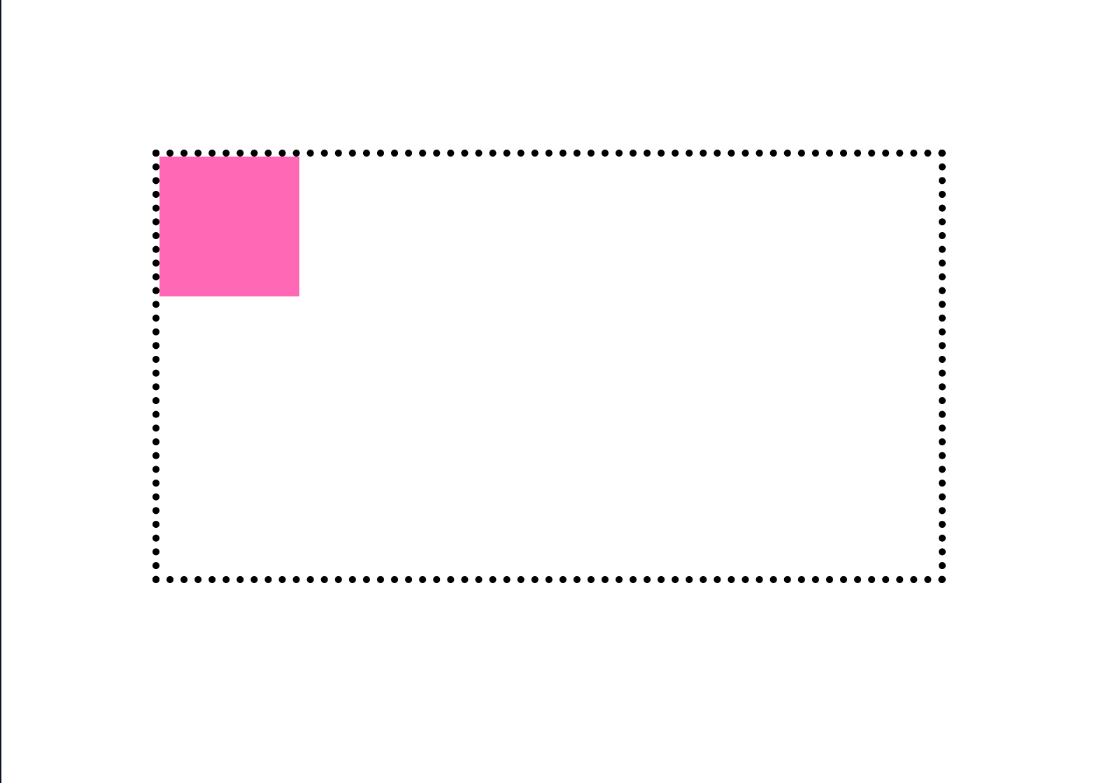
</body>Let us give the container and the child element some styles to visualize the current position of the child element.
body {
  padding: 100px;
}

.container {
  display: flex;
  height: 300px;
  border: 5px dotted black;
}

.box {
  width: 50px;
  height: 50px;
  background-color: firebrick;
}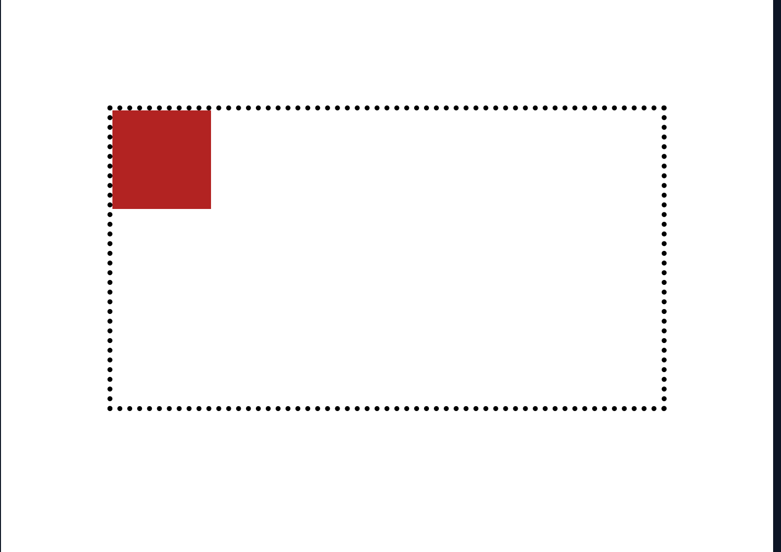
The position of the box is currently at the top left of the container but we want to get it to the middle. To do that, we can use two CSS properties:
justify-content: to specify the space distribution of the container.align-items: to specify the alignment along the block axis of the container. The default block axis of flex containers isrowmeaning that the child elements of the container are distributed horizontally. To change that you can useflex-direction: columnto distribute the child elements vertically.
body {
  ...
}

.container {
  ...
  justify-content: center;
  align-items: center;
}

.box {
 ...
}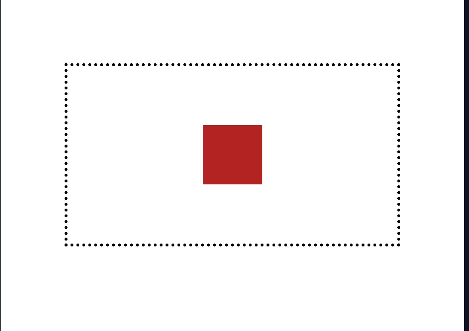
The box is now nicely placed in the center of the container!
Using CSS Grid
CSS Grid is a layout model designed for two-dimensional layouts, allowing the positioning of elements in rows and columns, providing a more robust and flexible way to design web pages compared to CSS Flexbox, which is more one-dimensional.
To give a container a grid layout, you simply need to set the display property to grid.
.container {
  display: grid;
}
Again, we will create a div using this container style and add a child element that we want to center.
<body>
  <div class="container">
    <div class="box">
  </div>
</body>
Let us also apply some styles to outline the container and make the box visible.
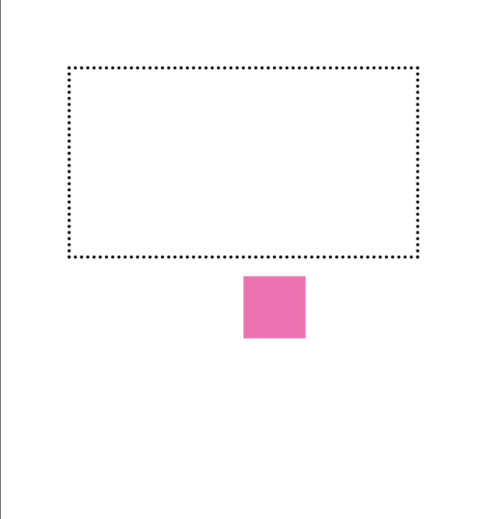
body {
  padding: 100px;
}

.container {
  display: grid;
  height: 300px;
  border: 5px dotted black;
}

.box {
  height: 100px;
  width: 100px;
  background-color: limegreen;
}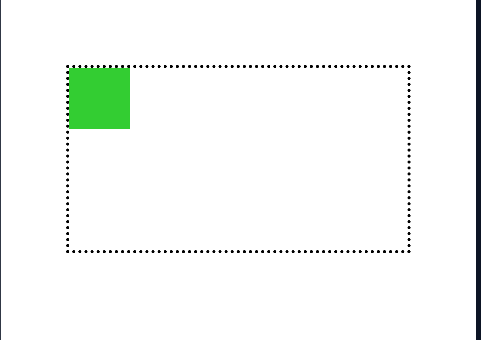
And again, the item is placed at the top left of our container. To move it to the middle, we use the place-items property.
body {
  ...
}

.container {
  ...
  place-items: center;
}

.box {
 ...
}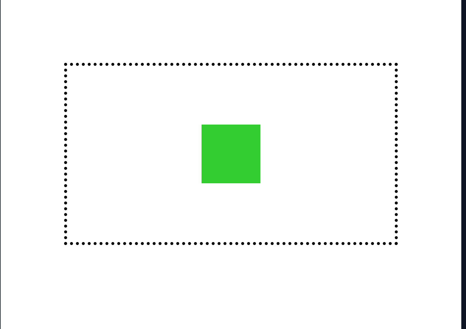
Now the box is placed in the middle of the container, Yay!
Using the position and transform properties
This is a more traditional approach to placing items in the center of their container by using the position property to specify where an element is placed in the document. The transform property lets you rotate, scale, skew, or translate an element. It modifies the coordinate space of the element.
Let us repeat the same steps we did before to have the initial position of a child element in the top left position of a container, but this time we would not set the display attribute.
<body>
<div class="container">
<div class="box">
</div>
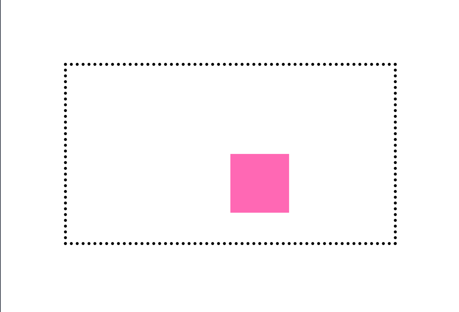
</body>body {
padding: 100px;
}
.container {
height: 300px;
border: 5px dotted black;
}
.box {
height: 100px;
width: 100px;
background-color: hotpink;
}
Next we need to change the child element of the container to be absolute and also set the horizontal position from the left and the vertical position from the top of the element to be half of it’s container width.
body {
  ...
}

.container {
  ...
}

.box {
  ...
  position: absolute;
  top: 50%;
  left: 50%;
}
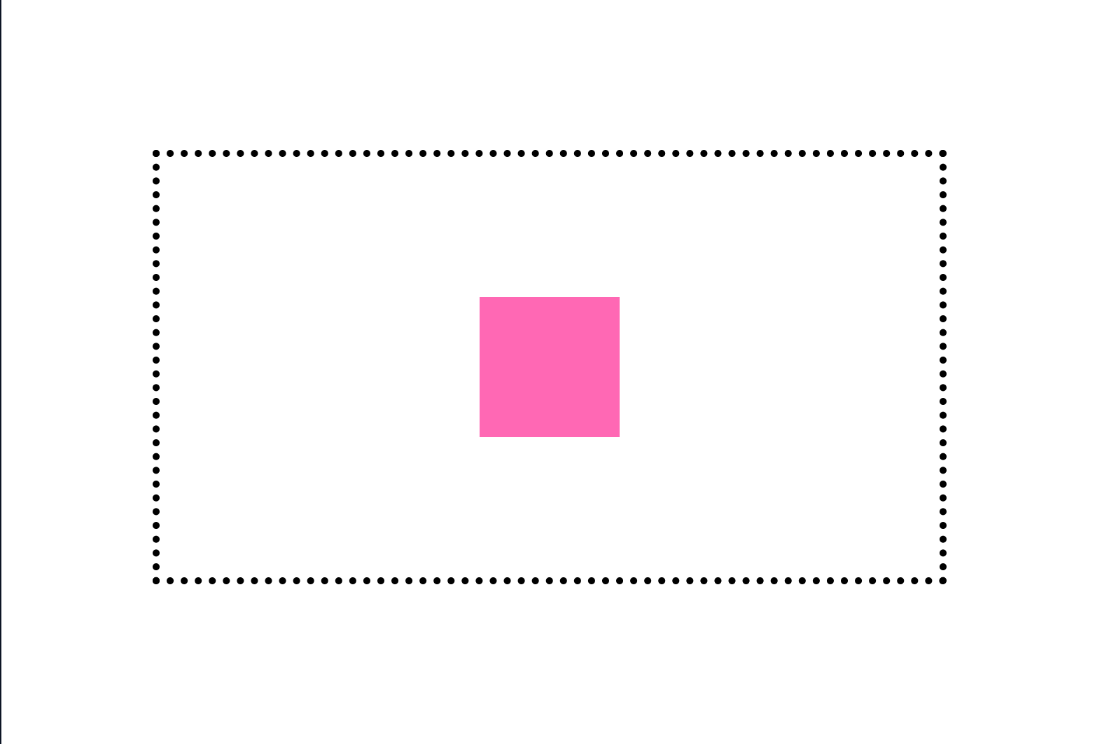
We have one small problem however. The box seems to not be relative to its container. This is because an element with position: absolute; is positioned relative to the nearest positioned ancestor. However, if an absolute positioned element has no positioned ancestors, it uses the document body, and moves along with page scrolling. To position the element’s container, set it’s position property to relative.
body {
  ...
}

.container {
  ...
  position: relative;
}

.box {
  ...
}
The box is now relatively postioned to the container but there is another problem. The box is centered in the container but with it’s top left anchor and not the center of the box itself. The image below visualises it;
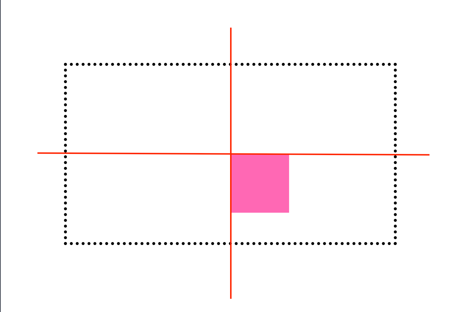
To fix this, we can offset the position of the box on the x axis by 50% of it’s width and also on the y axis by 50% of it’s height. This is where transform comes in handy and we can use it with the translate method.
body {
  ...
}

.container {
  ...
}

.box {
  ...
  transform: translate(-50%, -50%);
}
Now the box is centered in the center of the container!
Same goal, different method…
Despite how frustrating some things are to do in CSS, it is definitely amazing how you can do the same thing in multiple ways. I am sure there are more ways to center an element than the ones I have mentioned. If you happen to know a fun way, not neccessarily a simple way to center an element in css, please share in the comments 😃.